Hello dear friends,
Thank you for your patience during these months of absence. Certainly, life has thrown me a few surprises and this year has not turned out the way I was expecting AT ALL! Health, work, and other areas have been all over the map.
I might have mentioned previously that I got a puppy in November of last year. Well, my beautiful and loving puppy still doesn’t sleep through the night every night. So, while I was browsing Pinterest in the middle of the night I saw so many clever ideas that the designers from the Mid Century Modern period thought of and would still be modern now and also would still be considered innovative and current. If you have been reading my blog for a while you know I am a great admirer of the designers of this era. They were innovative, thoughtful and very clever. I am certainly looking forward to implementing some of these ideas in my own home.
- Install a shelf across windows so you don’t lose the daylight: as you can see in this example they have done a shelf all across the windows and it has given them an area to add some down lighting for nighttime without having to compromise the sunlight. Also as a bonus take a look at how they do open shelving on both sides so the shelf doesn’t feel out of place. If you had some cool vintage pots or sculptural objects you could also display them on the shelf. You just have to be sure not to overload it.

2. Convert a wall into a planter wall: I personally have no green thumbs but I think I would definitely appreciate having a narrow wall where I could get some sunlight and some greenery at the same time. In addition to that please look at the half round dining table that is useful but it doesn’t take that much space. Double whammy on this one!

3. Narrow wall unit; this has to be one of the easiest and most space-saving way to install a wall unit in any room. It is probably 3-4″ deep and it is fitted around this highboy, which will allow you to have real storage while also displaying some of your collectibles. So clever!

4. Technology hub: Ok nowadays we plug in different devices, but the principle is the same, in a kitchen you need to plug in a large number of small appliances at different times. Having a technology hub makes everything so much easier and it is cleaner looking than clogging your backsplash with outlets all over.

5. A small cabinet / drop front desk floating over another one: we all have needed extra space to write something down and to house our books. Leaning one end on a solid piece while making the other end float certainly makes this solid and airy at the same time. I especially love the wall treatments here and the fact that doing this created the perfect space for art on that yellow wall.

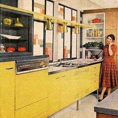
6. If you are looking for a way to design a kitchen in a light and airy way, then look no further than this. WOW! All of the appliances and tv are housed inside of 1 wall, and having the stove in a floating cabinet is simply perfection. Also, take a look at the slim profile of the hood they chose for this kitchen. This would look amazing in a small apartment in the city or in any home.

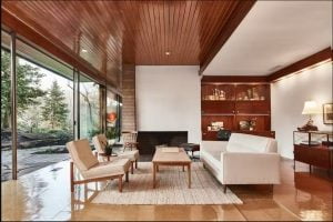
7. If you don’t want to feel like the built-in cabinets are massive and heavy in the room, then a solution might be to have open shelving on one side and make it asymmetrical. Look how the narrowing of the corner near the opening to the room gives the illusion of having more space because you can see more of the floor. Also, when I look at this picture I totally regret getting rid of a Lightolier table lamp that had the same shade as this one.

8. Tuck in a desk behind the sofa: with this one we have seen different options of desks in the living room. However, tucking an angular desk behind the sofa and a wall is a definite first for me. The desk lamp can also be used for the sofa and the desk can be used as a sofa table to put your drink while sitting on the sofa, genius!

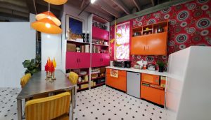
9. I love this optical illusion! Take a look at the clever use of wallpaper here from the top of the cabinets towards the middle of the ceiling, making it appear as if the wall is that much taller.

10. If I thought having a desk behind the sofa was clever, having a built-in desk at an angle as part of the kitchen is definitely the best idea yet. I love how they did the open shelf above so it relates to the desk and not the rest of the kitchen without making it feel out of place. And that planter in the corner of the cabinet and the desk heart, heart, heart!

11. And as a bonus one, for all those of you living in a small studio apartment, take note that you can use a small coffee table as a nightstand and just add a chair or ottoman to create living room space. It has to be the most efficient way to distribute a studio apartment ever!

If you like these ideas and are thinking about implementing them in your home let me know in the comments below or shoot me an email, I love to receive this type of email that let me know I helped you think about the possibilities in our home.
Picture credits: I created a board on Pinterest with these and other images that I find clever. And you can also find out who posted them in the first place. So go check it out https://www.pinterest.com/grestuff/clever/
Disclaimer: This is just my opinion, in no way my intention is to offend any homeowner. These examples are just to exemplify what I would do and/or what I consider a better option.
I hope you found this post useful, if you need help to refresh your home I am here for you. I can help you create a color pallet, a new furniture layout or just a different perspective on your space. As always if you enjoyed this blog please subscribe and share it with your friends. Even if they are not into MCM they will get something useful out of it. And we will love to see them here. My opinions and suggestions are based on my experiences and are not meant to be offensive or mean.
xoxo
Grethel


