Hello dear friends,
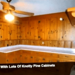
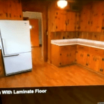
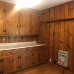
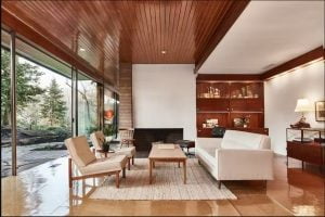
If you have a Mid Century kitchen that lacks the modern part and is predominantly Knotty pine, then this blog is definitely for you!
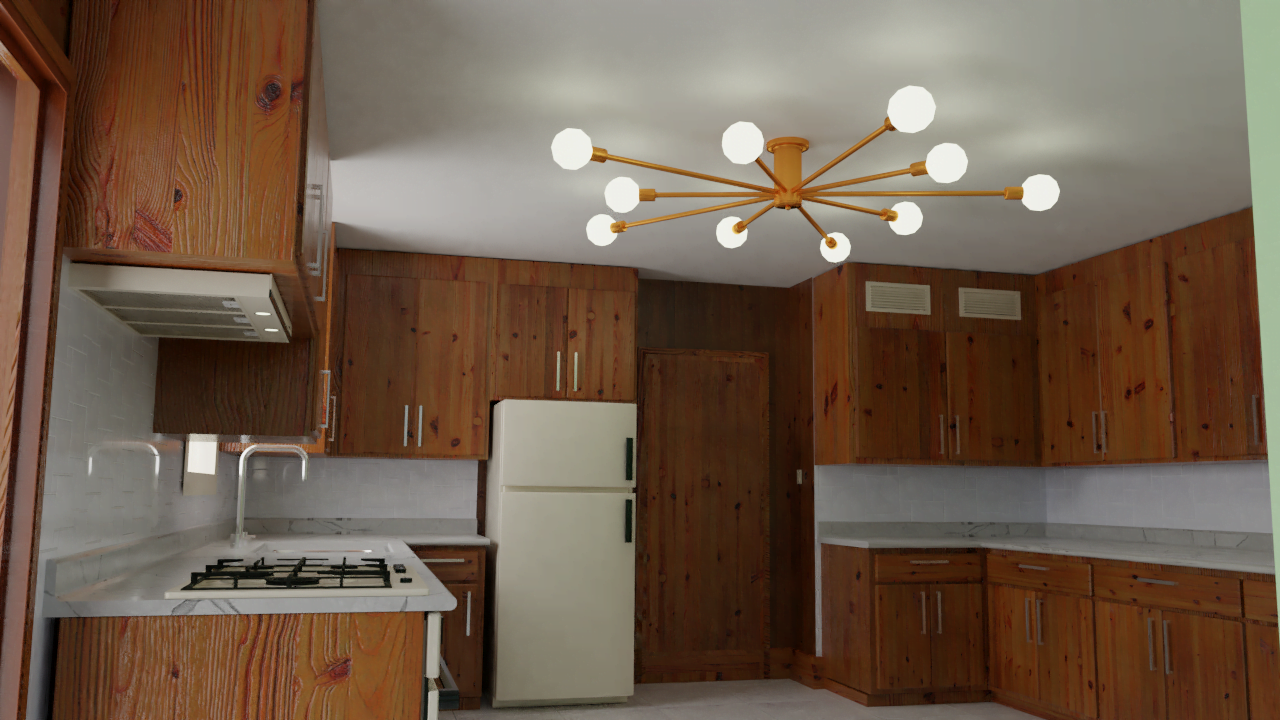
My homeowners are upgrading this kitchen in order to sell the house. With this in mind, budget-conscious is a must for the improvements. It needs to keep the MCM feel throughout the house but also it needs to feel modern and lighter. And of course, have the modern conveniences we want in every kitchen.
Let me start with the fact that I haven’t encountered anybody that kind of likes the knotty pine look. There are those that love it and those that hate it. So if you find yourself in the love it group but still want to have an updated space like the owners of this kitchen, here are the recommendations I gave them which can also help you.
- Paint the ceiling white or a light cool gray: Why? If you notice this kitchen lacks natural light, so you need as many light surfaces to reflect the light you have both natural and artificial and there is no better go-to than white for that.
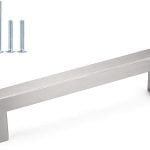
- Make the small hardware disappear: If you read my previous blog you know that one of the things I do not like from most of the MCM kitchens is the hardware. I especially haaaate the chevron / v shape handles. And the country-looking hinges…well let’s just say lose it and lose it all. Instead, let the Knotts on the pine cabinets shine, let that be your pattern and main attraction. Go for hidden hinges and a linear handle in stainless steel or brushed nickel.
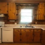
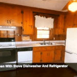
- Take all the curly decorations and shelves out from around the window, above the stove, or wherever they are. Leave as many clean lines as possible. This will help your eye focus on what is important in the space.
- On the window, upgrade to a white frame larger window. It will let more light in and the frame can help define and anchor the area of the sink.
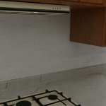
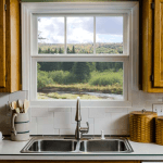 Backsplash: With the backsplash, I recommend either a geometric pattern or a long subway tile. I believe that these options will give a sense of airiness and style to your kitchen without making it look busy or cluttered. I also feel that geometric shapes do not compete with the pattern of the knotty pine.
- Countertops: As I explained before you will need as many light surfaces to reflect that needed light so white quartz countertops are my go-to for this. They are stylish, modern, easy to maintain and not as expensive as other materials. In my rendering, they show a wee bit yellow but I was going for white.
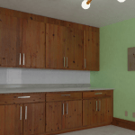
- Do an accent wall, and for this, I have 2 options: 1.Whitewash that wall with no cabinets. Whitewashing it would keep still the pine Knotts visible
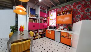
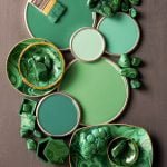 which would give you texture but not color and it will reflect the light. 2. You could use this chance to introduce some personality in the space. You know me, I am not afraid of color. I would definitely go bold here but stay away from colors that are hot like orange, mustard, red, pinks or too cool. Middle of the road is best in this case to appeal to buyers. A little warmth and some freshness. Huh? you thought I was going to say yellow didn’t you? Forest green or any of these greens recommended by Better Homes and Gardens would be my choice for this wall. Again, my rendering shows a lighter tone of what I am going for. I would like something fresh but a little bit darker.
 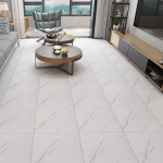 Flooring: I went back and forth with the flooring options for this space. I wanted something light and not wood (already too much) but I also knew a pattern would give it that extra MCM feel. We all have seen tons of vintage magazine ads for linoleum kitchen flooring with those fabulous patterns so here is a chance to really ramp it up without competing with the main attraction which in this case is the cabinets. I chose this pattern because it has a little bit of the warmth of the wood tone, it has the light that I need to make the space feels airy and open and it also has a pattern that is a nod to MCM.
9. Install a new hood, countertop built-in stove and an under-the-counter oven. All these appliances will have a minimal look. They will allow your eye to rest by giving you more of the lighter surfaces to look at and less clutter to focus on. For example, the stove won’t have a back with buttons. Instead, you will see the backsplash extended behind the stove. The oven won’t go all the way to the floor instead a cabinet that matches the base of all the other cabinets will extend the look along the bottom. A thin hood would be minimally invasive and will get the job done.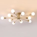
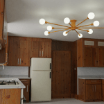
10. And finally, Lighting, I believe that a flat-mounted starburst chandelier will send enough light to every corner of this nice kitchen, it will illuminate every surface and reflect on that white ceiling so you can enjoy of a beautiful kitchen and see how many dog hairs you are seasoning your food with. What? TMI right? :D.
And in conclusion: let your knotty pine be the center point of your kitchen. If we put our thinking caps on there are ways of updating this type of kitchen without taking all the character out of it. What do you think? did you like it? Let me know in the comments below or comment on any of my social media platforms.
And if you found this blog useful and you think someone you know would like to read this please share it, subscribe to my blog, and help us spread the word.
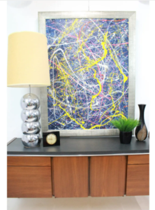
Disclaimer: As always this blog is meant to be helpful and to share the way I would do an update. It is not meant to be mean, disrespectful, or rude in any way. It is just my opinion and these photos are just to exemplify my recommendations.
Thank you very much for reading my blog and subscribing. I hope you enjoyed every post this year. And cheers to a HAPPY NEW YEAR!
Grethel
ps. Thank you to my homeowners for giving me permission to share this.

