Welcome back friend,
I sincerely hope that you and your family are well and are staying safe during this difficult time.
Since we have all been staring at the interiors of our homes, some of us have been inspired to paint the walls, some have been inspired to clean and dust and some others to do nothing at all, I mean decor related. Count me in this last group :). With the exception of finding inspiration in a leather-covered bookcase that I promised I will diy as soon as possible. If you didn’t see it on my Instagram you need to follow me @gre_stuff and look for my account if you don’t see my posts in your feed.
So for those of you that want to refresh your spaces and are thinking about painting; I want to tackle a few pointers about choosing the right colors to enhance your Mid Century Modern interior. Let’s start by asking you when you think about color are you brave or timid? If you answer I’m timid; the following tips will help you determine the direction for your wall color.
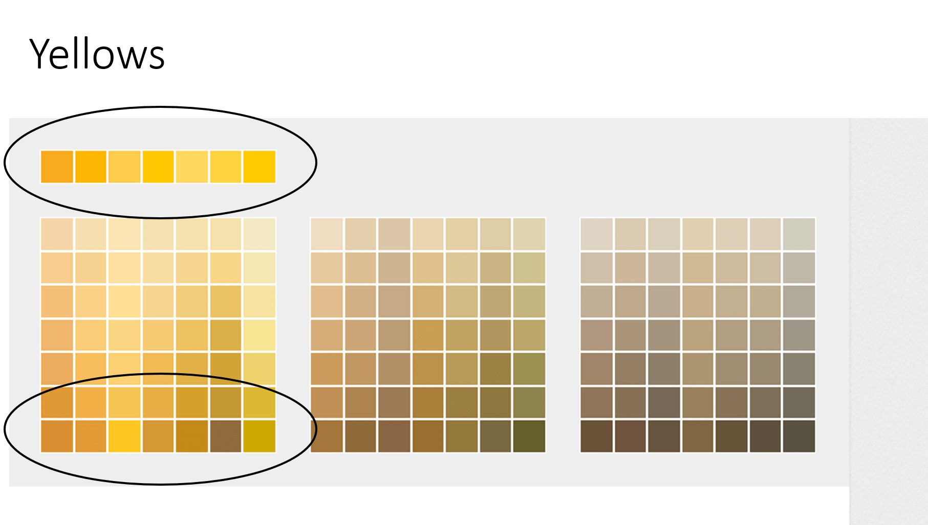
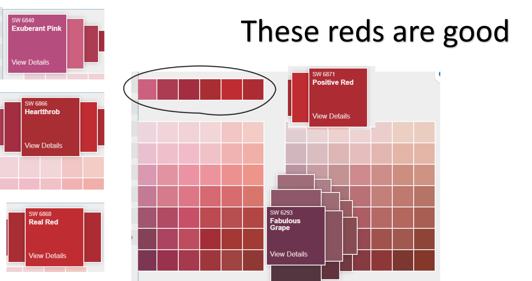
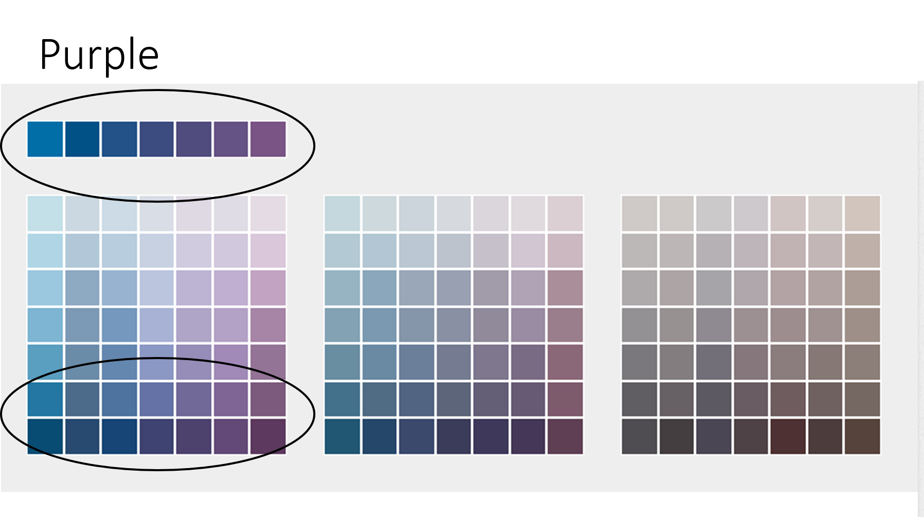
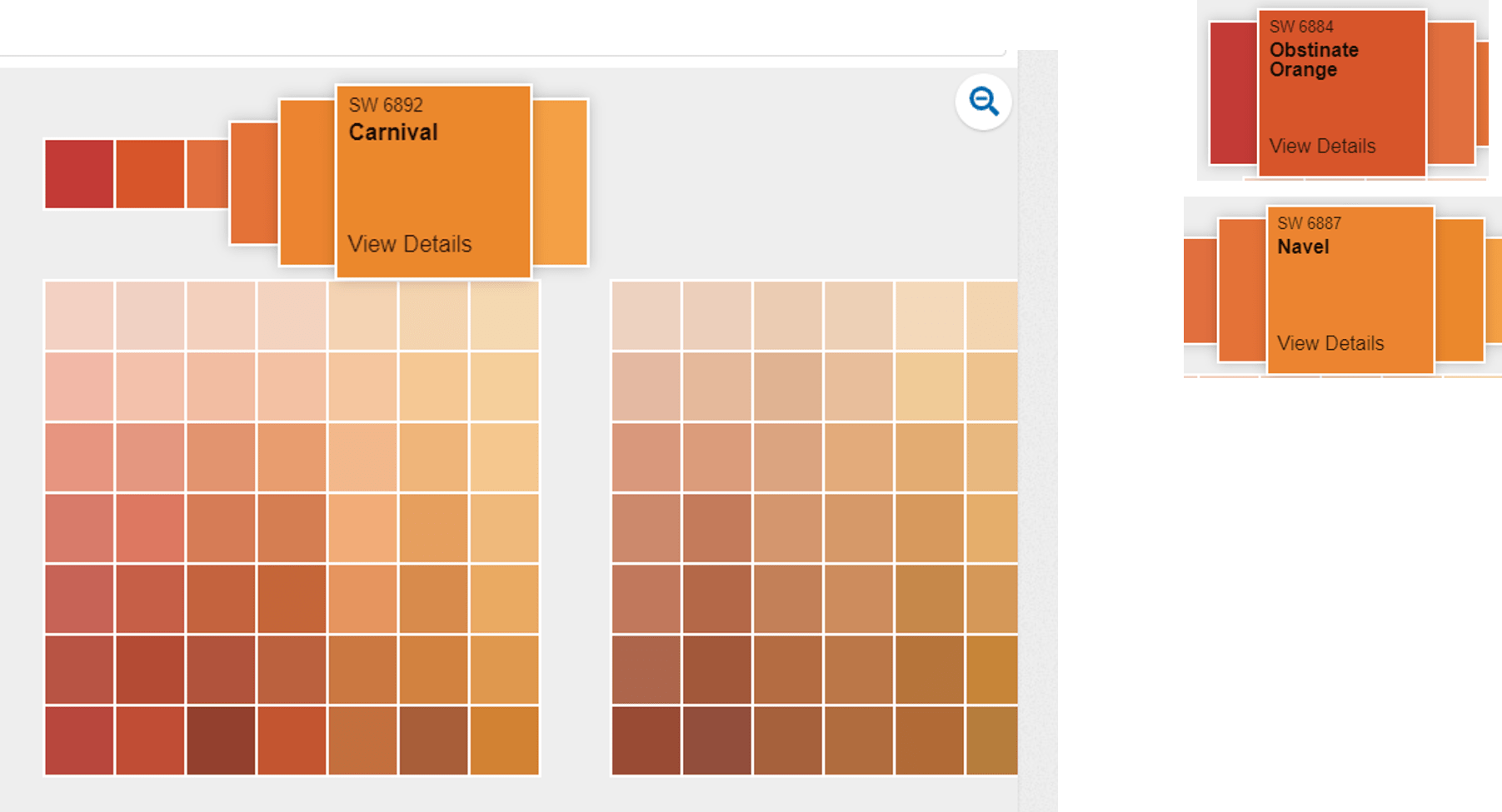
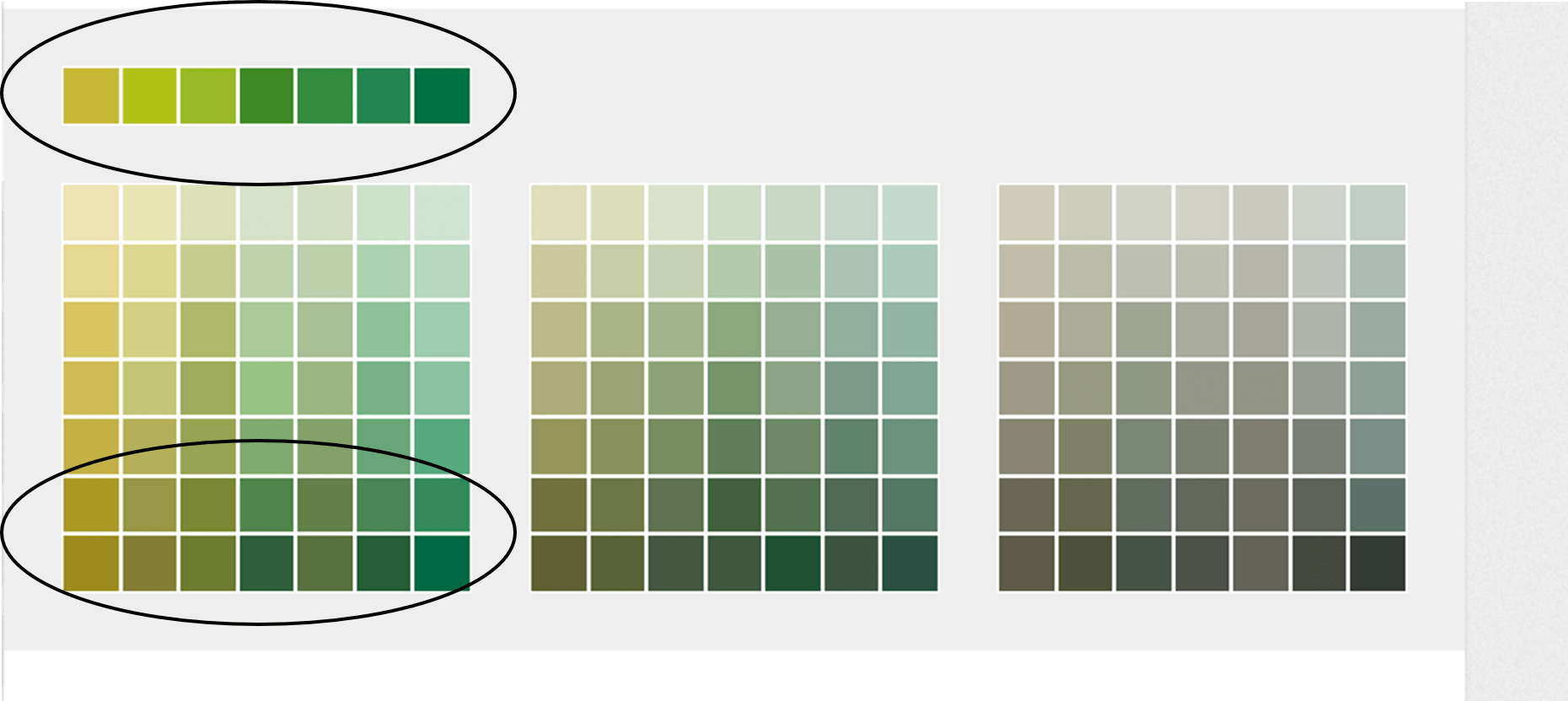
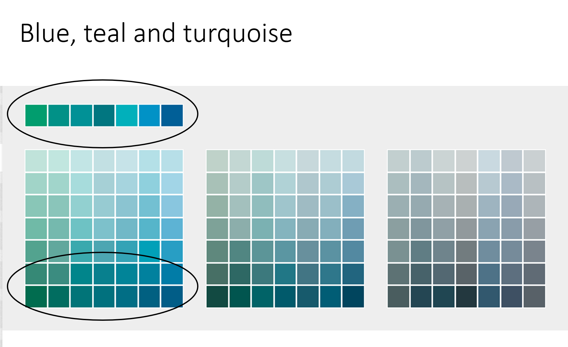
- Even though you can choose from the entire color wheel the following colors are the ones I recommend to stay within the Mid Century Modern style. And to accentuate the lines, colors and materials of your furniture and accessories. So go for the true colors, if you are going for orange use the true orange and don’t go for too dark and muddy. With green avoid the bright almost fluorescent green. Especially if you have glass and chrome furniture in the space.
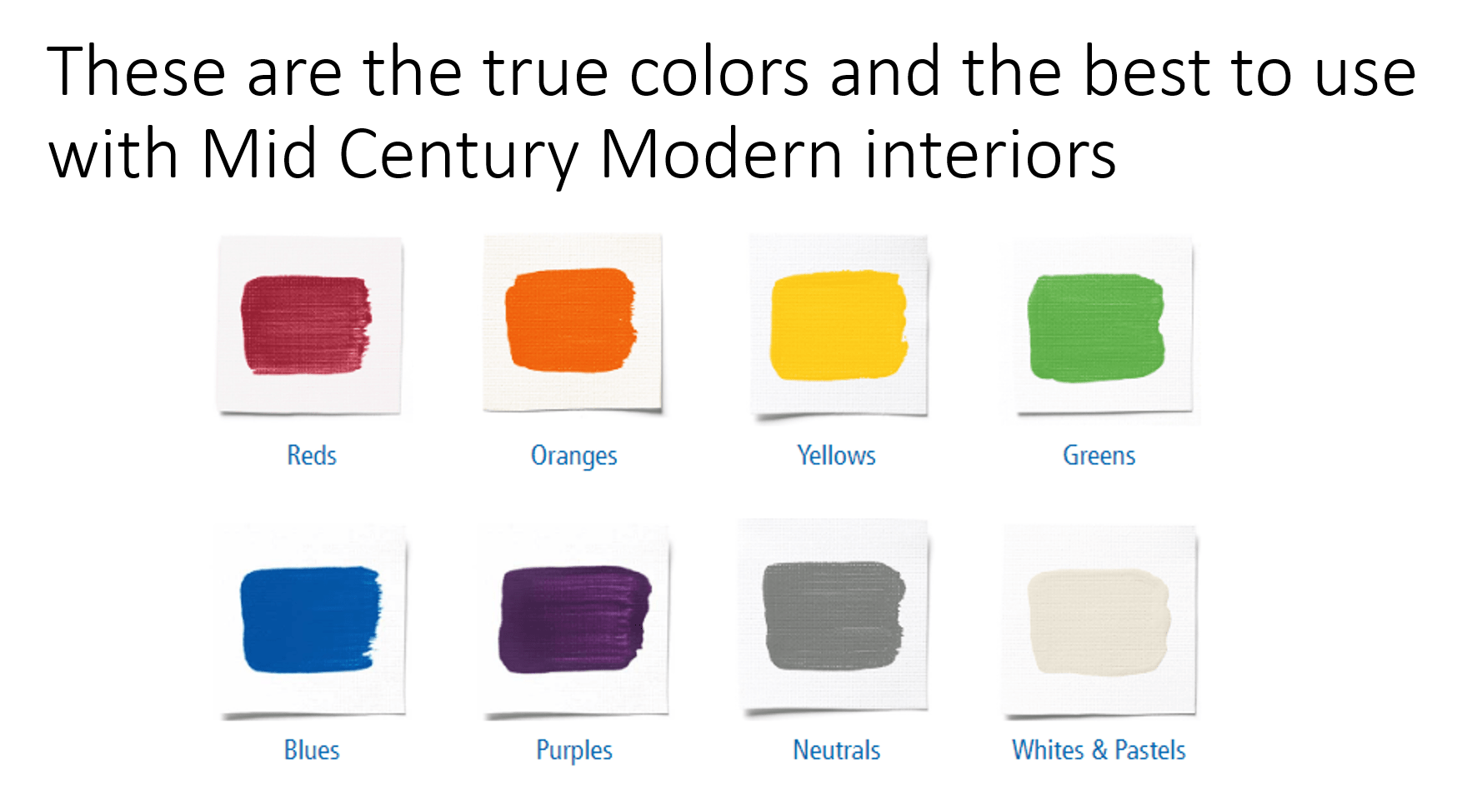
- Avoid going lighter; if you find yourself feeling scared when looking at a color and you think maybe I will go 2 shades lighter so I won’t regret it, please, stop and move forward with your first instinct of a true color or a bold color. Otherwise, you will end up with a soft baby blue, or a light kaki because you wouldn’t take a chance. You can always repaint if you find that you cannot live with the color you chose. But there are ways to ensure this doesn’t happen. Order a sample and test it around the room you want to paint so you can see how it reacts with the light of the room. Anything with a brown undertone will look darker in a poor lighted room. The colors I am recommending I have circled on each picture.
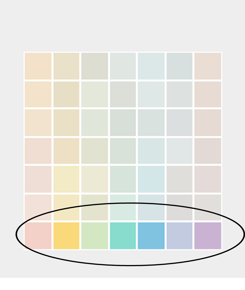
- Avoid pastels, these colors not only will not do anything for your interior but will not make your furniture pop. They do not belong in a Mid Century Modern home unless in a nursery.
- When in doubt here are three neutrals that you can count on if you feel you want to make a quick decision that might last for a good while.
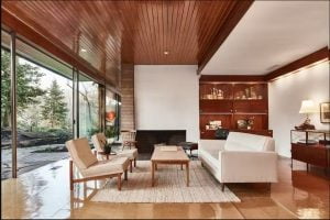
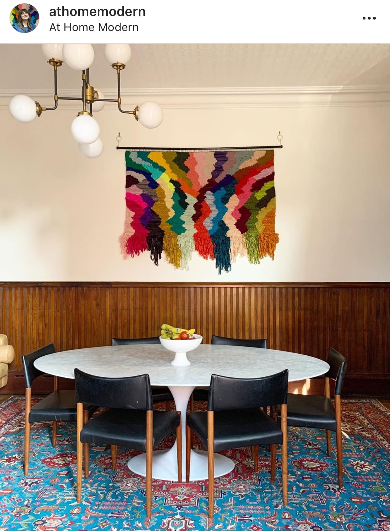
~White; you can never go wrong with the right shade of white. Try to choose something not too cold or with a blue undertone. Always think heavy cream color, yes like the one for your coffee. Take a look at this example from the talented Bobbie from At Home Modern. It is just perfect! Please follow Bobbie on her insta as a thank you for letting me use her pictures.
~Grey: a nice shade of grey can definitely add color in a way that won’t interfere with your furniture, textures or shapes.
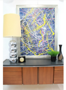
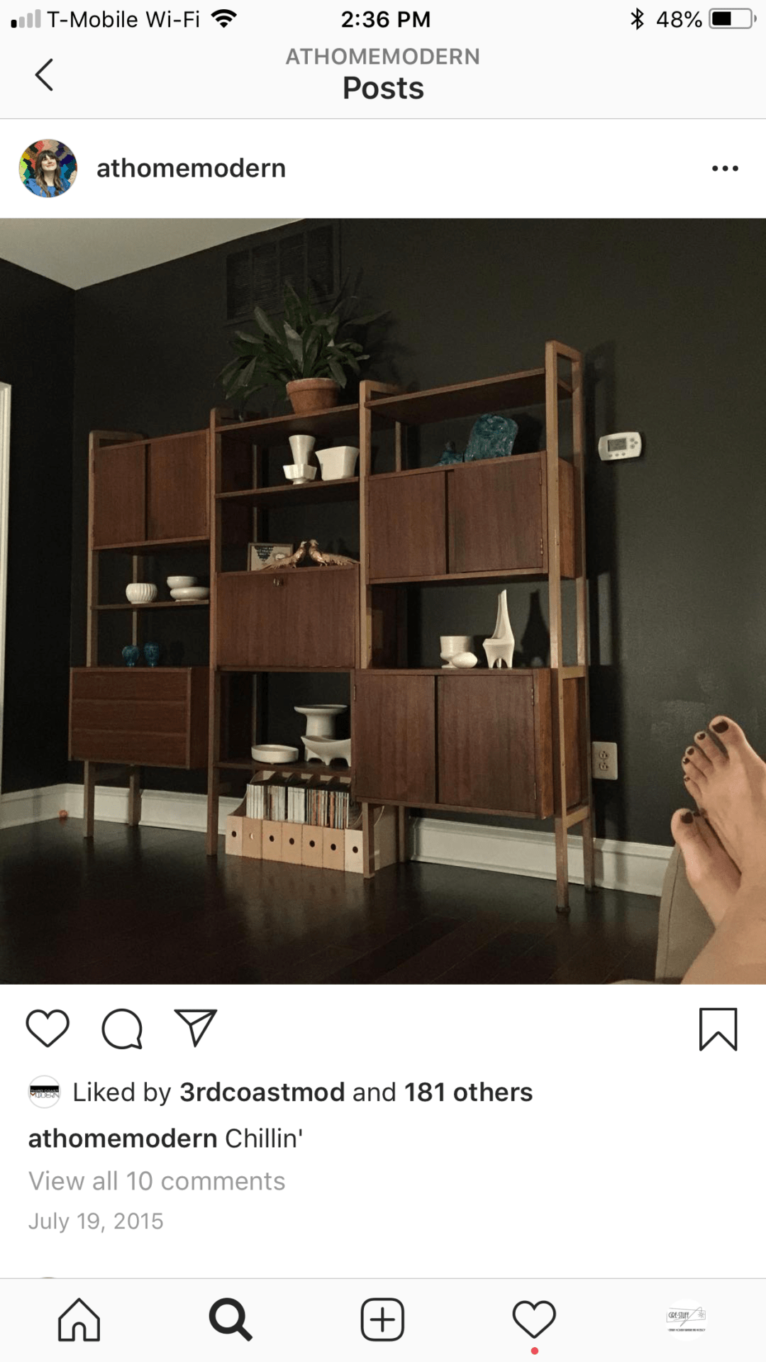
~Black: even though it is not a neutral that would recede to the background, it is a neutral that can enhance the look of your furniture when used in the right light. I would definitely say there has to be a lot of windows or enough lighting to make it work. But any piece of medium to light wood would look amazing with it. Take a look at another wonderful interior by Bobbie. She used this black color on her wall and it makes the furniture and accessories stand out.
From each color family, I have selected the ones I recommend. In my opinion, these colors are the ones that better go with Mid Century Modern interiors. They will make your furniture and accessories look very interesting. As always this blog is just my opinion, I don’t want to offend anyone, my only hope is that you find it useful and interesting. Please share it with your friends, comment either here or on social media.