Hello again,
So the past 5ish weeks have been super busy, and for lack of a better excuse let’s just say that I missed my previous blog writing dates because I was on vacation :D.
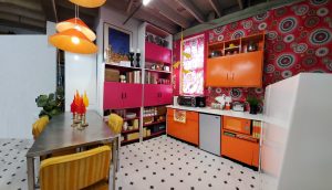
I wanted to talk to you about really getting down the principles of the MCM design. I have seen so many pictures of different homes and people talking about their style being MCM, however, their homes seem cluttered and very random or very empty and boring. I know we all have collections of furniture and accessories from the period that we like and want to exhibit but one thing is to say you have an eclectic home with pieces that you put together because you like to be a maximalist and another one is to say you have a MCM style and not follow the basic ideas behind the style.
So let’s keep in mind the following when decorating in the MCM style:
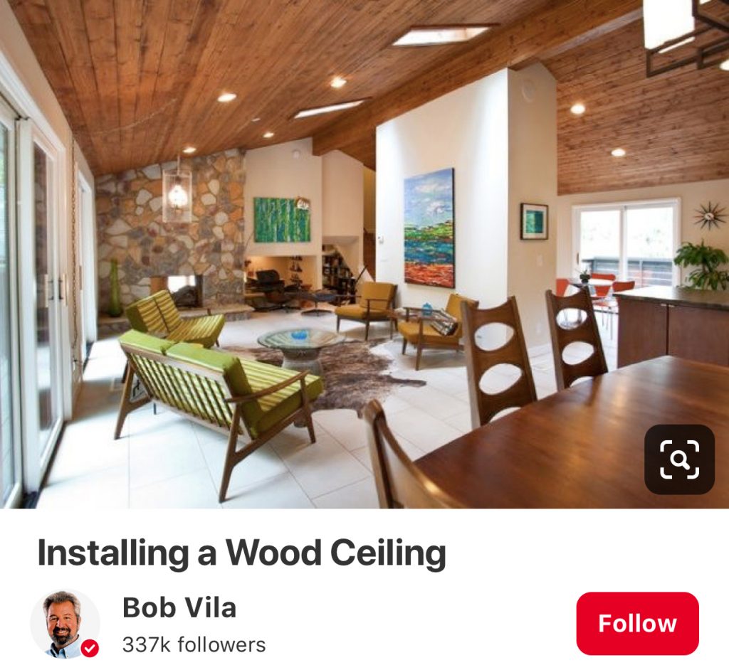
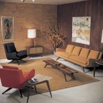
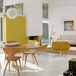
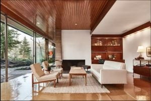
1. Have the right amount of furniture: with this I mean not too much not too little. There has to be a balance between how packed your space is and how much negative space you are leaving for your eye to rest between the pieces. Note in the examples I have below how there is enough furniture and items on the walls but also negative space around them. Giving them a chance to breathe and to stand out. Your eye easily travels through the space with no strain. And you get to appreciate the quality of the design, after all, one of the things the MCM period is known for is having awesome designers.
2. Cohesive pieces of furniture; as collectors we love the design and shapes of so many different pieces, however, furnishings should have a thread that unifies them throughout your space. You can choose complementing fabrics, shapes, textures, etc but they do have to have some sort of connection between them. If you have one element of each material and or each decade it will look random and cluttered. But if you have several elements that connect one with another your space will look spectacular!
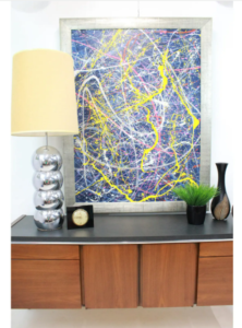
3. MCM is not about cluttered no matter how you see it, this goes against the very core principals of the style. No matter how many glass pieces, pottery pieces, knick-knacks, etc you have, it is not AT ALL about having a million pieces on display that make your furniture buckle from the weight. You can have collections of course, but do not fill your furniture, bookcases, tables, etc so much that you can’t even put a pin on them. Remember to do odd numbers and different heights to keep it interesting. Spread them through your home.
4. Choose the right size rug for your space: if you have a huge living room and your rug is only large enough to put your coffee table on it, it looks horrible. Believe me, you need to include your sofa, your chairs, tables, etc on top of your rug. You can do an accent smaller rug on top (layered) but no small postage stamp rugs in the middle of the room.
5. Add some highs and lows: furniture pieces need to vary in the space. Think about bringing your eye up and down and side to side. If you chose everything at the same height it will look monotone and boring. Especially if your home doesn’t have any architectural features that can help you with this.
And there you have it, let’s take a look at the examples below so we can have an idea on how to do it. As always if you enjoyed this blog please subscribe and share it with your friends. Even if they are not into MCM they will get something useful out of it. And we will love to see them here <3
Photo credits:
- http://kellygolightly.com/new-pink-door-in-palm-springs/
- https://josephbosco.com/mid-century-living-room-ideas/
- https://www.curbed.com/2016/11/9/13573008/charles-dubois-palm-springs-midcentury-modern-homes-for-sale.
- Homedesignlover.com
xoxo
Grethel

