Recently I spent a weekend in New York City celebrating my brother’s birthday. As you can imagine we had a blast in the city that never sleeps. And while we spent most of our time walking back and forth through the exciting streets of this beautiful city; my workaholic mind kept finding Mid Century Modern and vintage design inspiration all around me.
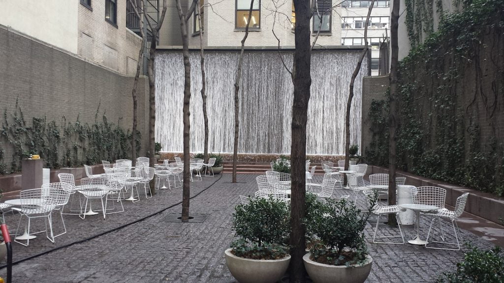
Like this area where the serene water fall, fronted by the iconic styling of the Bertoia chairs and the simple yet elegant lines of the Saarinen tulip tables. All of the elements of this space make a peaceful haven to have lunch or to read a book in the middle of this buzzing city. It’s my opinion that the designer of this space chose a neutral white in the way of the furniture because of its ability to disappear into the fore and backgrounds.
Since the entire city was decorated for the holiday season. Eye candy wasn’t exactly missing on this trip but I particularly liked the starbursts and lights that floated above the entrance of the Empire State building, the street light decorations and the window displays that not only made me feel like in a fairy tale but also reminded me of how great design is always timeless. All of these forms and shapes started way back in the space age era and are still relevant.
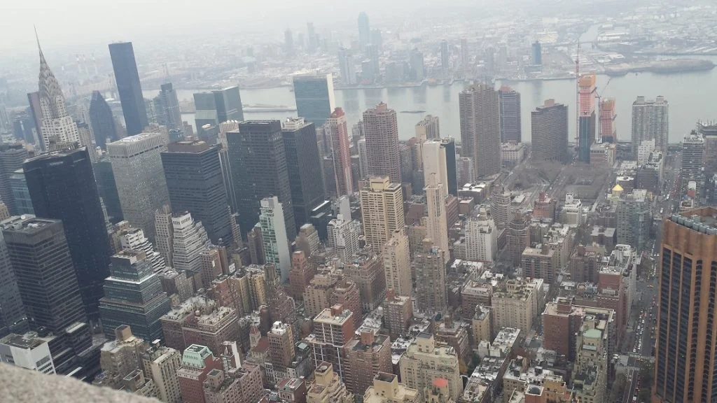
As in MCM design, geometric forms were not missing in the big apple. As a matter of fact you all know the city itself is a great example of geometry. Squares and rectangles fill the streets and building 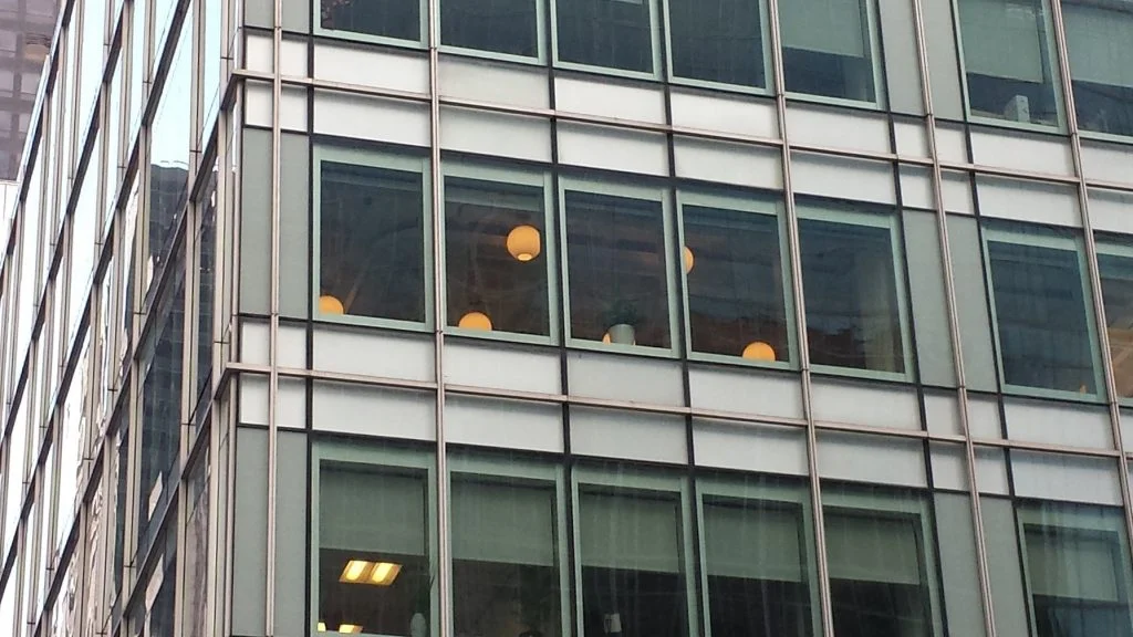 structures anywhere you see. And when you add the element of light to all these forms you can achieve something that it is truly breathtaking. Take for example the way these round lamps look against the straight lines of the building. Isn’t is a great example how geometric forms interact with light and are enhanced by it?!
I usually go through New York City with a business agenda and in a hurry but this trip really gave me a different perspective of the city. It allow me to find elements of inspiration even in places that I didn’t expect it. I am sure I will be using elements of inspiration from this trip in the near future and for a long time!

