Have you ever struggled with a furniture layout when decorating your home? Do you like too many different things and styles of furniture? Do you buy everything you like and throw it all together in hopes that it will look good in the space?
If you answer yes to all or some of these questions then this is the right blog post for you.
People have the misconception that they have not achieved a balanced, cohesive and beautiful interior because they lack the funds for it. However, it is my opinion, after so many years in business delivering Mid Century Modern furniture to homes and seeing how other people decorate and use their spaces, that the problem is not the lack of funds or taste but the misconception about needing more. More money, more furniture, more accessories, more collections, more space, etc. This misconception acts like a roadblock that results in these 3 common and crucial mistakes:
- People don’t know how to work a layout in relation to the architecture of the house.
- People buy everything that appeals to them and they are not paying attention to how it looks in the space and with the existing furniture pieces.
- People buy everything they like, put it all together in a space and hope that because they are conceptually complementary styles it will work out by magic.
Let’s tackled these mistakes one by one shall we?
- Let me start by saying that I firmly believe that the layout is generally determined by the architecture of the house. So if you are not incorporating the walls and the focal point or lack thereof you will not achieve a cohesive blend of Mid-Century modern design.
In order to get some sort of order or starting point, I would suggest seeing what is your focal point and ask yourself the following questions: where does my sofa fit in relation to it? Do I want my focal point to be the tv or do I want it to be a fireplace or a piece of furniture? How am I dealing with the ugly architectural parts of the room? What do I not like in this room? The layout is so important that can make or break a space. Pay attention to windows, weird corners, and angles, arches, cubby holes, closets, and doors and anything that can either distract or enhance your interior.
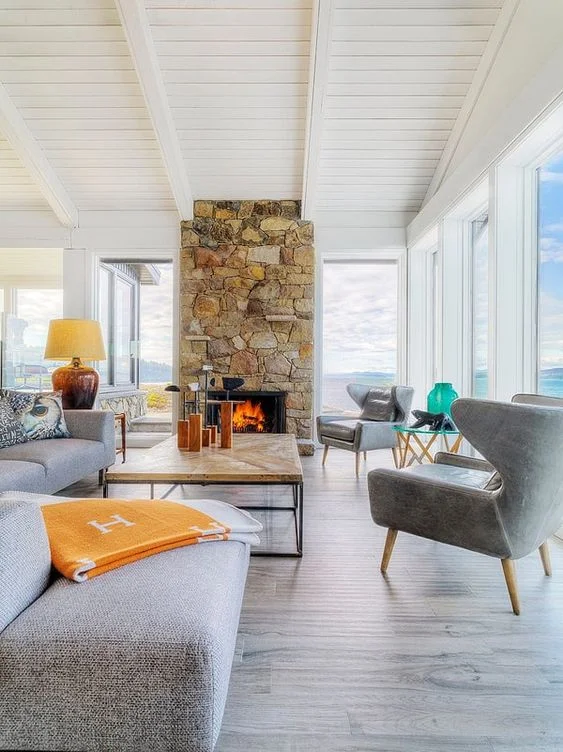
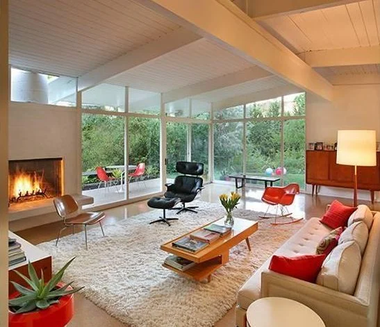
Take a look at this example, you can clearly see that the space is huge and the ceilings are super high, the windows clearly reveal an awesome view which is a focal point in itself in addition to the fireplace. And pay attention to how the layout allows you to incorporate both focal points at the same time. The couch has been positioned in a way that is floating in the middle of the room. They have incorporated the view, the fireplace and made an intimate space out of a large and open room.
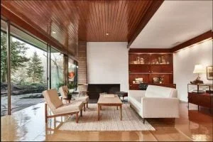
2. People don’t look at the relationship between the furniture pieces they are buying and the existing pieces of the space. You always want to make sure that there is a common thread that connects all the pieces without going matchy-matchy. Meaning if you have a chrome and glass dining table and you are in the market for chairs, make sure you buy either chrome legs upholstered or wood and upholstered. Because if you buy chrome legs with no upholstery it will look stark and cold. Do you see what I mean? The common thread is the chrome but you add upholstery and it is no longer matchy-matchy. In this example: they felt the need to leave a lot of space between the chairs because they don’t relate one to the other. To me, closest to the fireplace should be the Eames chair with the ottoman. The fireplace inspires to lounge there and enjoy the warmth on a cold day. The other 2 chairs Eames and the Herman Miller rocker are so low and small for the space that you really would need at least 2 to make an impact. Furthermore, near the window, I would either do 2 of those slatted benches or do a bench that has at least part of it upholstered. Definitely you need something bigger there.
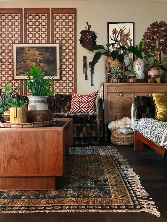
3. As we blend Mid Century Modern furniture with other styles we are attracted to all sorts of different variations within the style and beyond. But buying everything that appeals to the eye is not the solution. It is good to experiment with different pieces and different styles but we always have to edit. As a rule of thumb, I would say stick to 3 styles, do 60% of the one you like the most and divide the other 40% between the other 2 styles you like. In this picture, it is clearly a Mid Century Modern and bohemian combo. And the reason why it works is that 60% is Mid Century Modern (sofa, cushion pattern, screen pattern, coffee table and daybed) and the rest is bohemian (layout, accessories, plants, mix of patterns, baskets, ceramics) with an antique case piece and rug.
To recap these are the 3 things you have to keep in mind when decorating:
- Find your focal point and how your sofa relates to it.
- Find the common thread between the furniture you have and the ones that you are adding.
- Stick to 3 styles 60% your main style, 40% the other 2.
These are my recommendations, I hope you find this blog useful and you have a better idea of how to avoid the 3 mistakes in your interior. Please let me know in the comments below which of the 3 common mistakes are you guilty of? What 3 styles do you like the most? and if you have friends that might like this blog please share it. We want our family to grow and we would love to see them here.
Credits:
https://www.pinterest.com/pin/21181060716955678/
https://www.pinterest.com/pin/383017143311786555/
https://www.pinterest.com/pin/293859944436776154/
Disclaimer: This is just my opinion, in no way my intention is to offend any homeowner. These examples are just to exemplify what I would do and what I consider a better option.

