Hi friends!
I want to talk a little bit about what we want to say with our furnishings, some of us might want to say this home is happy and vibrant, maybe a little bit chaotic, some others might want to say this home is relaxed and comfortable, I’ve heard people say; I want my home to feel formal and structured; others prefer a casual feel. Whichever your objective is for your home, that will determine what colours, textures, shapes and accessories you will fit into your space.
It is proven science that different colours give us different feelings, let’s see what they evoke in us:
1. 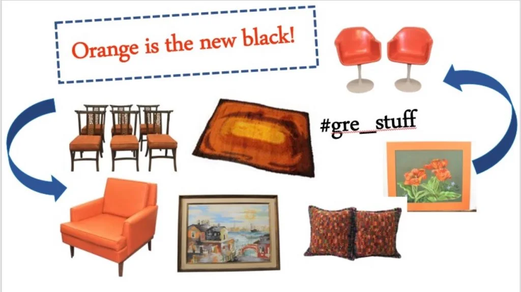 Orange is associated with joy, sunshine, and the tropics. It represents enthusiasm, fascination, happiness, creativity, determination, attraction, success, encouragement, and stimulation. It is the only colour to take its name from an object; the orange.
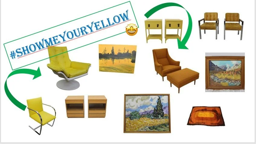 2. Yellow is the colour of sunshine and associated with joy, happiness, intellect, and energy. It is an excellent choice for kitchens, dining rooms, and bathrooms. In hallways, yellow can feel welcoming.
3. Red is an excellent accent colour, you can use it to make a ‘cool’ room warmer; red is great for kitchens and it is known to increase appetite, and red accent walls can change the way a room is perceived. As the most intense colour, red raises a room’s energy and is a good choice when a homeowner wants to stir up excitement.
4. Pink, on the other hand, represents compassion, nurturing, and love, and depending on the hue, it can make a room playful, feminine, and warm.
5. Green is the colour of nature. Considered the most restful colour for the eye, green can transcend a sense of calmness and security when used in interior design. 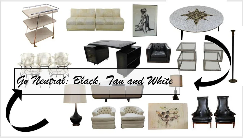
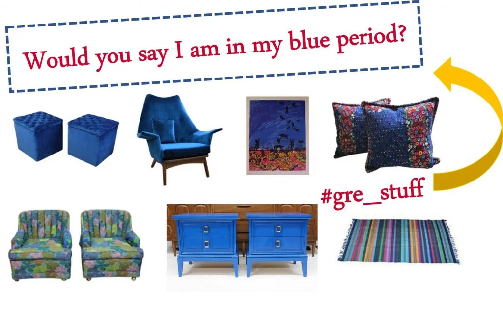
6. Blue, by far, is the most popular colour in the US and is associated with trust, loyalty, wisdom, confidence, intelligence, faith, truth, and heaven.
7. Purple, in its darkest values, is dramatic, rich, and sophisticated. It can give a design scheme depth and is associated with luxury and creativity. Lighter values of purple, such as lavender, can add a restful quality to a bedroom.
8.
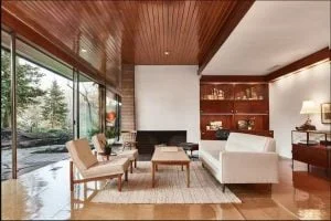
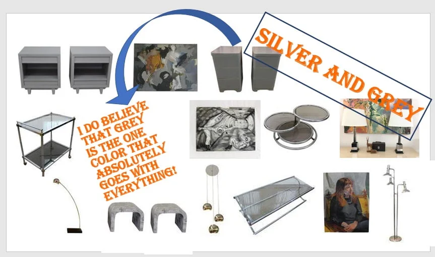 Since most of the designers of the MCM period were trying to be innovative and exciting they used a wide variety of colours and textures in their interiors and in their furnishings. Most of which were attractive to the eye and had the objective of evoking feelings of new, fresh and out of the ordinary.
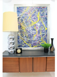
We can appreciate also the use of colour in the art of the period. As you know, I love abstract art! (if you didn’t know, just check out our artwork section, you’ll see…)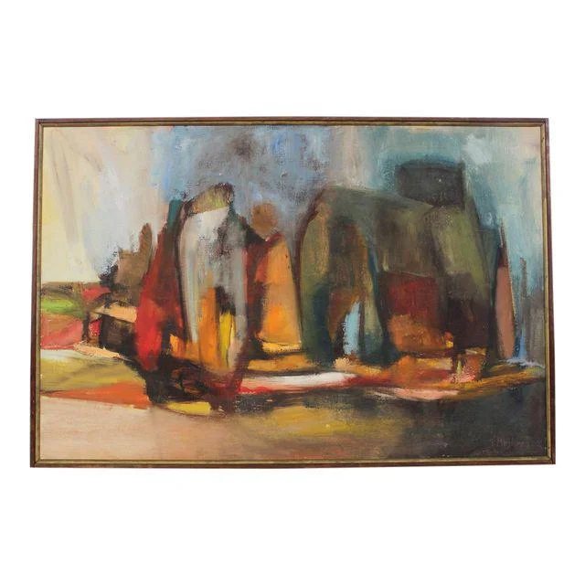
In the past, I have mentioned that I love to start decorating a space from the colours of a painting and then choosing the rest of the furnishings based on that. So with that in mind, which colours do you gravitate to? Do you go neutral or colourful? Leave me a comment below or continue the conversation on any of the other platforms, and if you are not following me yet, head that way, it’s free :). I would love to read about what the majority of you prefer.
xoxo
Grethel
Credit info:
KATHRYN POMROY
https://www.theartcareerproject.com/blog/psychology-of-color

